

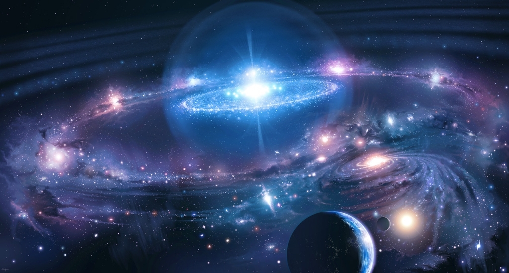
There are 250 billion stars in our galaxy alone. Many are much like the sun, labeled with the Latin sol for “sun” in this diagram. But many more are not quite what we might expect stars to be like, after living under the light of a white G2 star our whole lives.
Wait a second. White G2? Since when is the sun white? And what the heck does G2 mean?
I’m talking about its spectral type — a classification system that organizes stars by their temperatures, determined by what they’re made of. The sequence is O, B, A, F, G, K, and M, in order from hottest to coolest. The sun is a fairly cool star.
But the thing is, the spectral types don’t actually tell you anything about how bright the star is, how big it is, how luminous it is…I could go on.
So how can we make things easy for ourselves and classify stars according to spectral type, size, and luminosity all at the same time?

Meet the H-R diagram, or — if you’re a fan of long names — the Hertzsprung-Russell diagram, named for its creators. This graph expertly organizes stars by most of their identifying qualities, and it is perhaps the most important graph in astronomy.
The first thing you should take note of is the horizontal axis, where you see a rainbow fading from blue into red and the spectral classes I mentioned above. Let’s take a closer look at what exactly spectral classes are, since we’ll be talking about them a lot from here on out.
Basically, if you aim a special device called a spectrograph at any star, the light it produces will be separated out into the colors of the rainbow — the way you see the horizontal axis above. But something else happens…
Elements — the building blocks of star stuff, as well as everything else in the universe — in a star’s atmosphere block some of the star’s light. But they don’t make it dimmer. They block certain wavelengths, making little black lines appear on the rainbow where certain colors have failed to reach our instruments.
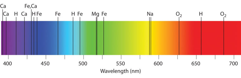
These are called absorption lines, and they tell us a lot about the materials in the star. But because certain materials can only be found in stars of certain temperatures, they also tell us the temperature of the star.
We can then sort stars according to their temperature and composition…
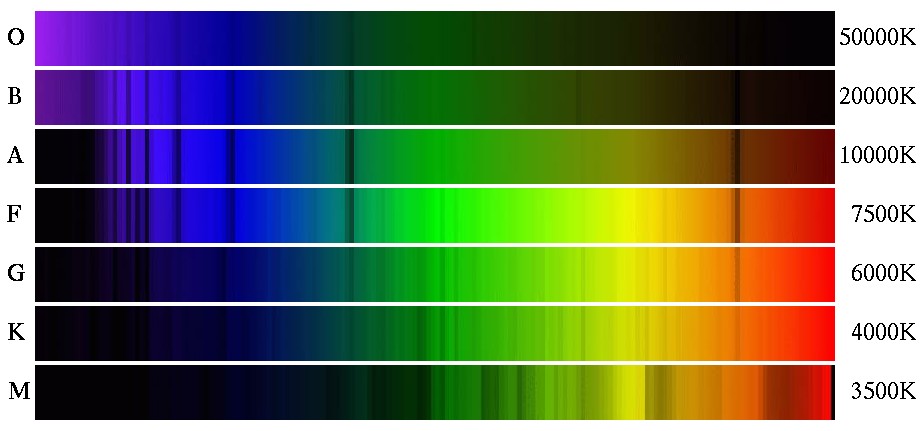
This image shows a set of spectra — the result of the spectrograph — from several stars, stacked one on top of the other. But they’re in order of spectral type (see the letters on the left) from hottest to coolest, showing you how the dark absorption lines fade smoothly in and out of existence.
What this demonstrates is that stars do not naturally form into distinct “types” — they exist on a range of hot stars, medium stars, and cool stars that we have arbitrarily defined into types for our sorting convenience.
To clarify, the rainbow at the bottom of the H-R diagram isn’t a stellar spectrum. Stars grouped into the different spectral classes appear as different colors to our eyes, according to their wavelength of maximum intensity.
Basically, hotter stars appear blue, mid-range stars appear white, and cooler stars appear red. The rainbow-colored strip at the bottom of the graph is just a helpful visual to remind you of what colors stars will be on the diagram.
So, now that you have a better idea of what spectral classes are, let’s take another look at that H-R Diagram.
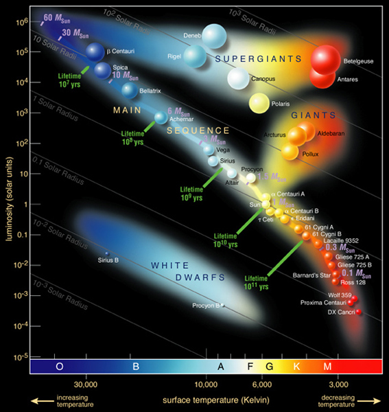
That the spectral classes make up the horizontal axis tells you that from left to right, stars are organized by their temperature — hotter stars on the left, cooler stars on the right.
So, clearly, β Centauri — the star farthest to the top left — is much hotter than Proxima Centauri, the second-closest star to the bottom right.
What does it mean that these two have similar names, differing only by a Greek letter? They’re both located in the constellation Centaurus, which can be seen only in the southern sky. The designation “β,” or beta, means that it’s the second brightest star in the constellation.
But that just means it appears second brightest from Earth. The one thing the H-R diagram doesn’t do is sort stars according to their apparent visual magnitude, which is how bright they look from Earth and has nothing to do with how bright they actually are.
Let’s take a look at two other Centauri stars on this H-R diagram, α Centauri A and α Centauri B.
Their “α” designation means they’re the brightest star in Centaurus. But how can they both be the brightest? And they’re on the cooler side of the H-R diagram — how can they be brighter than β Centauri, which is up among the hot blue stars?
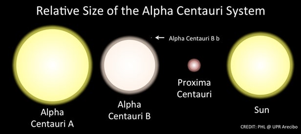
α Centauri A, α Centauri B, and Proxima Centauri are all part of the same star system — unlike the standalone star in our own solar system, they all orbit one another. I’ll go into further detail about how this works in a future post.
The stars of the Alpha Centauri system are all actually dimmer than β Centauri, but because they’re much closer to us — in fact, they’re the nearest star system to Earth — they appear brighter, and achieve their “α” Greek designation.
So, we’ve covered the spectral classes. We’ve taken a look at a few of the main sequence stars, the ones that are all along the line that slashes through the center of the diagram. Let’s take a closer look at luminosity.
It’s something I’ve talked about before — just in my last astronomy post, in fact. Luminosity is a measurement of all the radiation coming from a star.
It’s different from apparent visual magnitude and absolute visual magnitude. These are both scales ranking stars according to just the visible light they emit. We can’t see light in non-visual wavelengths — all the other wavelengths of the electromagnetic spectrum.
But just because we can’t see that radiation doesn’t mean stars don’t emit it. Luminosity includes all wavelengths of radiation that any star emits.
And — surprise! — luminosity makes up the vertical axis of the H-R diagram.
So, let’s put it all together.

Let’s start by taking a look at the white dwarfs at the bottom left. What do you notice about them?
First, they’re on the bluish side of the diagram, all between spectral classes O and F. This means they’re all going to be hotter than our sun, which is a G2 class star.
Second, they’re also quite low on the luminosity scale — meaning they don’t emit a whole lot of radiation.
But why would this be? How can a star be hot, and yet not be very luminous?
Because luminosity doesn’t just depend on temperature — it also depends on surface area.
Consider a candle flame. You can eat dinner by candlelight because it’s not very luminous. Its light is very soft and gentle. But what if the candlelight increased in height…but not in temperature?
The temperature never changed, but because it became much taller, it became more luminous. It might be so bright it would drive you from the table.
The same goes for stars. White dwarfs are very hot, but they’re not very luminous because they’re also very small.
Now that you have a pretty good idea of how to read an H-R diagram, we’re ready to dive deeper into the world of stars. Next up in astronomy, I’ll examine the finer points of white dwarfs, giants, supergiants, and main sequence stars.


Did I blow your mind? 😉